A few weeks ago we showed our readers Conrad Burry’s leaked prediction for what the Denver Nuggets’ fourth and final jersey would look like. Burry is a graphic designer who writes about sports jerseys for sportslogos.net and often is the first person to reveal new design changes to team’s jerseys. Here is what his first “guess” looked like.
This content is no longer available.
He was pretty much spot on about Denver’s Nike “City” jersey but there are a few update that were revealed today when NBA2K (accidentally?) revealed all 30 teams’ new threads. Below is the latest leak.
First, there does appear to be a thin yellow side panel on this jersey although it’s difficult to tell if it is anything more than just a straight line.
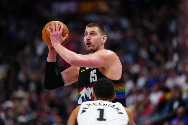
Second, the pickaxe logo is much bigger than expected. It appears to span the entire chest of the jersey.
Third, the collar does not appear to have a white trim to it as Burry initially thought.
Fourth, the logo is not entirely yellow. There is a blue line on the pickaxes and half of the mountains are white.
It’s hard to read too much into this latest leak since the image is pretty grainy but NBA2K does have a history of revealing jerseys, court designs, and logo changes so there is a really good chance that this is 100% accurate. They are a bit plain for an alternate but aren’t ugly either. I’ll chalk that up to a win.
What does everyone else think?
This content is no longer available.


